


Thin Walls:
Title & poster design - 2025
The project involved creating both the title design, used for the film’s opening and closing sequences, and the promotional poster for a short film. The director wanted a cohesive visual treatment that could translate the film’s tone and themes into its graphic identity, ensuring both the titles and poster felt like a natural extension of the story itself.
Project Aim
The goal was to create a cohesive visual identity for Thin Walls that communicates the film’s exploration of solitude, intimacy, and emotional rediscovery.
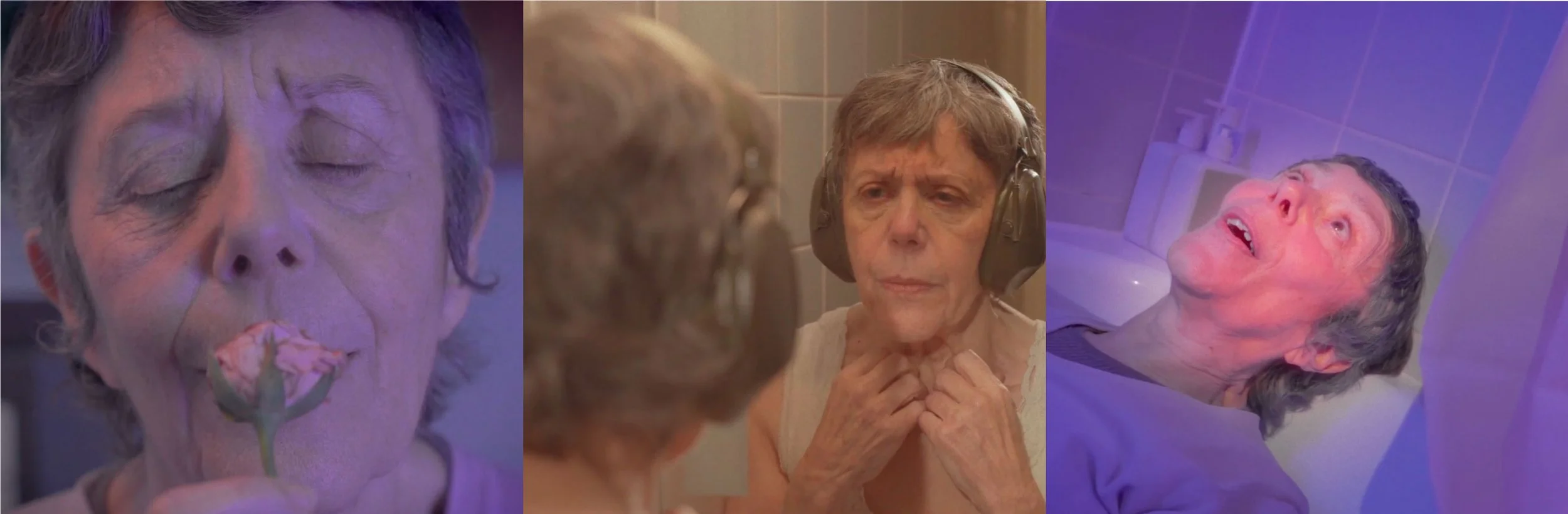
The short film tells the story of a woman who runs a small-town motel known for fleeting encounters, while remaining emotionally withdrawn and detached from intimacy herself. Through the course of the story, she begins to reconnect with herself, prompted by a finding an old letter and a dried rose from a past lover, revealing a quiet, deeply personal journey from isolation to self-intimacy.
The visuals needed to express the film’s delicate juxtaposition of contrasting elements: the muted, static atmosphere of the motel versus the bursts of bold, exuberant moments, mirroring the protagonist’s inner tension between solitude and self-discovered intimacy.
Proposed Approach
To capture the essence of Thin Walls, the design avoided literal references to the title. Instead, it drew inspiration from the story’s emotional contrasts, rigidity versus fluidity, distance versus closeness, to form the foundation of the visual concept.
The treatment emphasised the tension between the quiet, contained world of the motel and the expressive, intimate moments that punctuate it. Through composition, texture, and tone, the visuals highlight these contrasts while guiding the viewer’s attention to the emotional core of the film.

Title Design
To reflect the film’s juxtaposition of rigidity and fluidity, I paired contrasting typefaces for the two words in the title, one blocky and monolithic, the other soft and calligraphic. I explored four approaches, testing ways for the styles to interact, including interlocking compositions and repeating the full title in both styles. The final choice, guided by the director’s feedback, features the words interlocking while retaining their distinct characters.

Colour treatment:
Colour palettes were drawn from the film frames immediately before the intro and outro titles. The intro leans muted greys, greens, and pale yellows, while the outro shifts to lilacs and pinks. After experimentation, we settled on a mushroom grey for the intro and dusty rose for the outro, grounding the titles in the film’s visual tone while highlighting its emotional progression.


Poster Design
Concept & Treatment:
Building on the same idea of juxtaposition explored in the title design, the poster expands the theme of contrast between rigidity and fluidity, but this time through imagery. Rather than literally depicting the “thin walls” from the title, I chose to represent what felt truly at the heart of the film: the rose gifted by a past lover that the protagonist continues to hold on to. Throughout the story, she revisits this symbol of affection, a quiet reminder of intimacy and connection, and that became the emotional anchor for the poster.
The composition centres on the character’s aged hands delicately holding the rose, a visual metaphor for rediscovered tenderness. The hands were digitally hand-painted to capture the depth, wrinkles, and texture of skin, evoking a sense of physicality and age, while the rose was rendered in a flat, graphic silhouette. The tension between the tactile realism of the hands and the stylised simplicity of the rose mirrors the film’s broader contrasts, between isolation and closeness, restraint and emotion.


Layout & Composition:
Several layout variations and colour explorations were tested, extending the palette established for the title design. Muted greys, greens, and soft pinks were adjusted in tone and intensity to find a balance that felt both intimate and romantic. The final composition, developed through iterative feedback with the director, captures the emotional essence of the story, grounded yet deeply personal.
