From Brand Rollout to Brand Ownership
Visual identity - 2025
Crosstide
Crosstide (formerly known as 101 Ways) is a tech consultancy that recently underwent a full rebrand, including a new name, logo, and visual identity, which was delivered by an external agency. I joined the company as their in-house Graphic Designer right at the handover point, just as the rebrand was wrapping up and it was time to launch it into the world.
I became responsible for rolling out the brand across platforms, building the missing pieces, and acting as its guardian as it took shape in the real world. Beyond applying the initial elements, I worked to define how the identity would evolve, developing new systems like iconography and presentation templates, crafting campaign visuals, and setting the direction for future extensions such as illustration, animation, and using our colour palette at its full potential.
This case study brings together the projects and decisions that helped shape Crosstide’s new identity in its earliest phase, turning brand foundations into a cohesive, intentional system that adapts naturally across different use cases.
Establishing Crosstide’s Iconography:
When the Crosstide rebrand was handed over, iconography hadn’t yet been developed, leaving a key gap in its visual system. Early in the website redesign, particularly on the employee benefits page, it became clear that icons were essential to complement the content and provide quick, accessible visual cues.
To fix this, I set out to create a distinctive icon style that would feel original to Crosstide and align with the brand’s clean, mature aesthetic.
I opted for a line-based style over solid shapes to reflect the structured, minimal language of the brand. To make the icons look unique and layered, I combined solid and dotted lines of equal weight, an approach that created an interesting optical illusion: the dotted lines appear lighter, adding a sense of depth and dimensionality while using just a single colour. This allowed for more articulated icons that remained lightweight and legible, while adding sophistication without visual clutter.
Extending this to a full bank of icons, I designed the system with real use in mind. I researched likely scenarios across the business, tech-specific icons, team and process visuals, client-related elements, and general UI needs, then built a flexible set that could serve multiple touch-points.
As part of this bank, I also developed clear guidance on sizing, colour combinations, and accessibility, making the system easy to apply consistently across presentations and digital platforms.
Warmth and personality through illustration:
While the new brand provided clear direction around its assets, it quickly became clear that something was missing. Relying solely on photography not only limited how we communicated abstract ideas (particularly common in tech consultancy), but also resulted in visuals that felt repetitive, generic, and lacking distinction.
Introducing illustration helped solve that by providing a more flexible, expressive visual language to articulate complex topics, and crucially, it added something the brand was missing: personality. While the overall identity felt polished and mature, illustration brought warmth, character, and a hint of playfulness that made the brand feel more human and approachable.
After exploring different stylistic directions, from flat minimalism to expressive, hand-drawn approaches, I landed on an isometric style. This allowed for a modular system that could scale from simple spot visuals to more intricate scenes, all while keeping visual coherence.
I began by testing how the brand palette responded when used in different combinations, especially how background tones shaped the mood and contrast of a scene. By layering in other shades through elements like architecture, figures, or tools, I was able to create compositions that felt rich and balanced, while staying unmistakably on-brand.
This also unlocked new potential for our accent colours, shades like violet, coral red, and sand yellow which had previously felt disconnected or too bold to use consistently. Through illustration, they found a clear role: drawing focus, adding energy, and elevating scenes with a warmth that complemented the cooler base tones.


Applications and uses:
While the illustration style was crafted to be flexible and expressive, its true value comes to life in its application.
In one example, a social media concept shows how illustration can work in tandem with typography and layout. By weaving accent colours like (in this case) sand yellow and coral red into the illustration, we’re able to echo those tones through headline type and graphic elements, creates a cohesive, on-brand visual system rooted in context. Unlike photography, illustration gives us the control to make these moments feel intentional and connected.
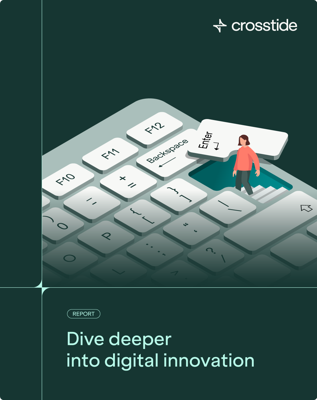
In another mock-up, a fictional research report uses illustration to inject personality into an otherwise formal format. Rather than defaulting to clichés or dry visuals, the scene creates a more engaging, playful way to express abstract themes, while still feeling aligned with the brand’s tone. Together, these examples show how illustration doesn’t only clarify, in fact it adds richness and resonance.

Bringing Information to Life with Animation:
To bring more energy and clarity to copy-heavy content like infographics, charts, and case study posts, I introduced a minimalistic approach to animation, focusing on subtle, clean movements that help highlight information and guide the eye.
One example shows how motion can make a donut chart feel more dynamic and engaging. Another plays with the brand’s grid system to animate a text-based case study, using rhythm and structure to add visual interest and make the content more meaningful.
While simple in execution, this first phase lays the groundwork for more expressive animation in the future, with potential to evolve into richer storytelling through motion.

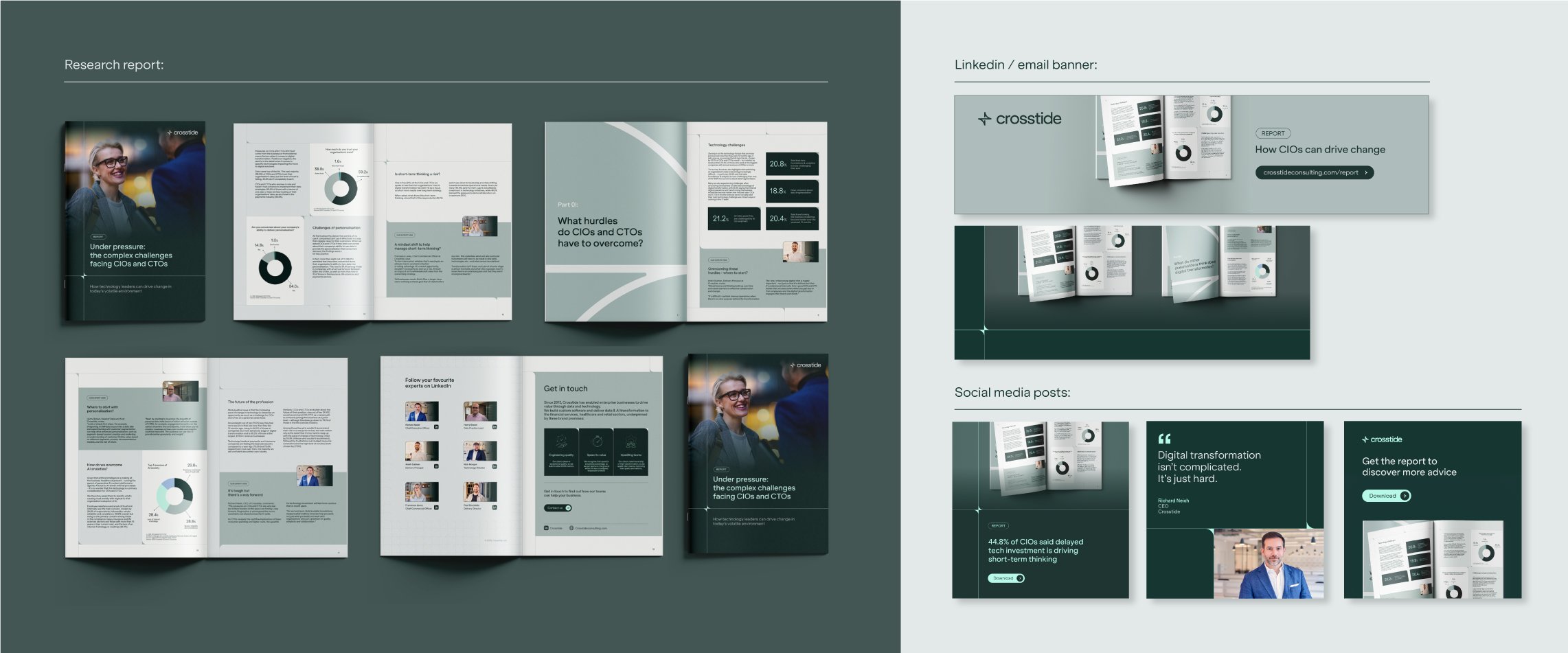
Research report and campaign assets:
This was the first research report produced by Crosstide following its rebrand, a fresh opportunity to build something from scratch. With no specific visual guidance in place for this type of format, it was a chance to create something both impactful and highly functional.
The report explored the complex challenges faced by CIOs and CTOs in today’s tech landscape. The content, developed by the marketing team, was dense with insight, data, and stats, and its main objective was to deliver clarity and structured information.
I leaned into the brand’s grid system and typographic structure, building layouts that flowed smoothly across both digital and print formats. I balanced the use of infographics, donut charts, bar graphs, and styled advice sections to bring variation to the pace and texture of each page. Every element was designed to support the reader’s journey through the content without sacrificing clarity or visual interest.
I also led the print production process, ensuring the report was delivered on time for a key event linked to its release. Alongside the report itself, I supported the marketing team by creating a suite of campaign assets, including website visuals for the download landing page, blog imagery, email banners, and LinkedIn content (from organic posts to shareable banners for employees). All these assets borrowed from the visual language of the report to create a seamless, consistent campaign.
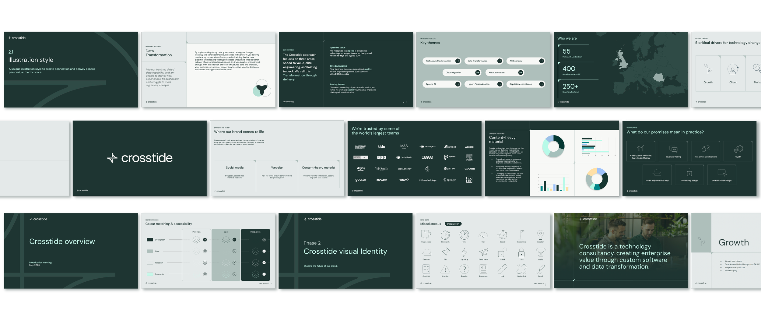
Building a Flexible, User-Friendly Slide Deck Template:
Following the initial visual examples provided by the agency, I took on the task of developing a comprehensive Google Slides template tailored for Crosstide employees. The goal was to create a versatile, on-brand, and professional presentation tool that would support a wide range of internal and external communication needs.
To do this, I first analyzed typical presentation structures and themes from the old brand’s decks, including common scenarios like quotations, imagery, title slides, agendas, diagrams, and charts. This research helped me group and build a variety of layouts that cover the most frequent use cases.
The template is designed with usability and brand safety in mind: key design elements are locked to prevent accidental alterations, while editable areas allow users to customize content easily. Multiple variations of layouts offer flexibility to suit different presentation goals.
Beyond just the slide designs, I made sure the template is future-proof, it can be continuously updated and expanded as needs evolve. To support this, I included instructions within the deck itself to guide users on accessing the full slide library and understanding how to work within the template.
A crucial feature is the embedded feedback form, enabling users to share their experiences and challenges. This direct feedback loop informs ongoing improvements, ensuring the template remains relevant and user-friendly.
Overall, this template is a living resource designed to empower employees to create consistent, polished presentations that truly represent the Crosstide brand.